
13 Creative Mobile App Navigation Examples In 2021
Mobile navigation designs are alluring and attractive as they come in many diverse patterns. If all kinds of businesses and industries use the same kind of navigation systems, then it would have been simpler for the end-users to navigate through apps. But as a matter of fact, navigation designs depend upon the number of products or services you wish to showcase to your consumers.
For instance, a restaurant has a wide variety of cuisines and dishes to display on the app, at this instant navigation helps in sorting them in such a way that they look clean and clutter-free by implementing a design that serves their personalized requirement.
On the other hand, if the number of items is as less as 3-5 then it is required to have a less complicated tab bar of sorts. In this blog, we will see some incredible and innovative navigation designs, where designers can easily find and get the best possible solution to fit the products for all kinds of businesses. Keep going with me till the end to find out.
Principles of Mobile App Navigation Design
The most functional and manageable mobile app navigation design does more than just helping the user in-app navigating. The main purpose of this mobile navigation design is to make the customer engage with your product in order to elevate sales.
Below given are the principles you need to follow while designing mobile app navigation.
Minimalistic feature – This is an important feature because the screen size between the mobile and the desktop design differs. The task that users carry out in your app should be the priority while designing the navigation pattern. It should guide them in the right direction in a simple way.
Stay consistent with the design pattern – Never change the content in the menu bar or other options on different pages. Try not to confuse the user but rather make things easier for them when they navigate around the content in your app.
Be logical – Always ensure that the visual cues make a lot of sense to the user they help in making the user understand what’s happening in your application and orient them by showing the things they can do. So for this reason, app navigation does not require an extra user guide or additional explanation regarding the functions because users may get highly disappointed if it accidentally leads to something else.
Guide users – It shouldn’t give users a chance to think, about whether to move forward or not. The navigation should be prompt and influence enough to make them take the next step.
These are a few essential factors to consider while planning a mobile app navigation design. Now, let’s go through various examples in Mobile App Design.
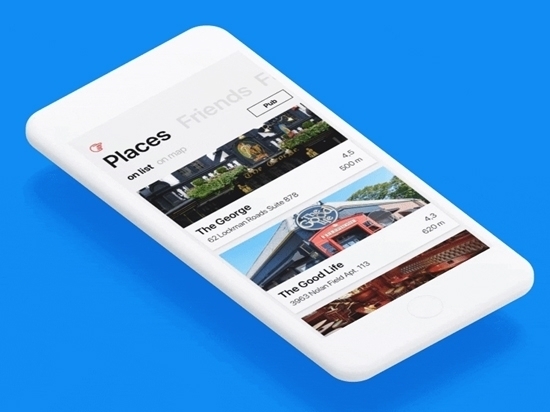
1. Pub guide
This is used for windows and OS and it follows a unique way of navigation system. It consists of clean bold fonts and a heavy layout with big size tabs and the transition which fades between the maps and makes the list view interesting.
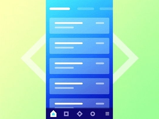
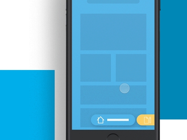
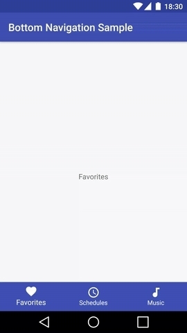
2. Bottom Navigation
This is one of the most sorted designs which consists of a bottom tab bar that helps the user to navigate with thumbs with a simple tap. It is undoubtedly impressive visually and comfortable with functionality.
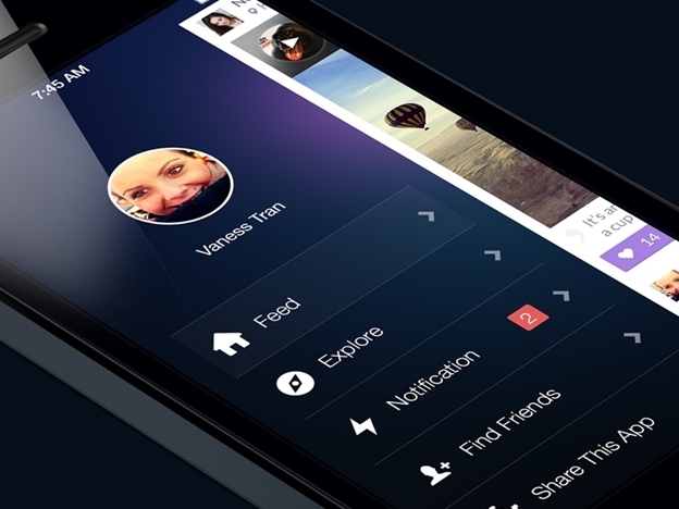
3. Side Menu Navigation
This intriguing side menu navigation uses a distinctive hamburger icon and extraordinary transitional effects while opening and closing.
4. Google Newsstand Navigation
TheGoogle newsstand navigation has a different type of layout with three different stages of the similar navigation menu with a distinct purpose. The top level is for focusing on the topics, and the lowest level is for readable content.
5. Reach Navigation search
Reach is truly very innovative in implementing the search functionality. Rather than cluttering the screen with another menu at the top, the search bar has been made as one of the tab items to search for the needed items for simple and easy access which opens with simple filters.
6. Overview navigation
In this, the transitions switch effortlessly from a horizontal layout to a less space-consuming vertical layout along with progress indicators.
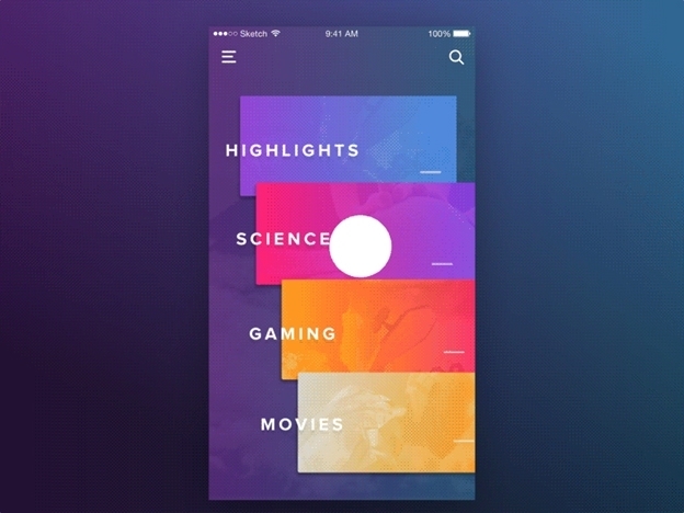
7. Colorful Navigation
The animated concept did its job pretty well with some visually pleasing effects used for the transition from hamburger icon to a full-width and full-height list of navigation.
8. Side Navigation
The amazing side navigation can do transitions from a full-height 90-degree list to a wider horizontal list. All you need to do is just tap the expand button on the lower left.
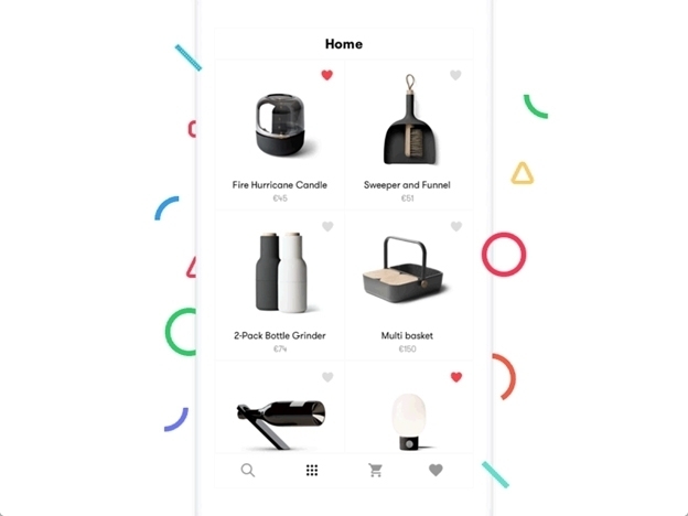
9. Bottom Navigation
The bottom navigation triggers some elegant visual animation effects when you tap the add button. The remaining user interface is faded out and the focus gets diverted to two new navigation items.
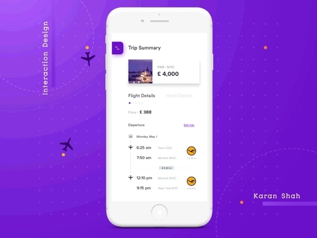
10. Interaction Navigation
This Interaction Navigation is a well-defined idea for designing app navigation, as it initially displays the navigation items in full view and you just need to choose the item and tap on it once. While scrolling it is compressed into a hamburger icon and this allows content with an optimal view.

11. Grid Styled Menus
This can consume plenty of space on your screen, yet it never distracts the user and holds their attention on every option available, and also gives a clear idea about the purpose of the product.

12. Gesture-Based Navigation
The best example of this kind of navigation is dating apps like Tinder, Bumble, OkCupid, etc. The concept of gesture-based navigation is introduced by apps like tinder, matchmaker, and truly madly which keeps the user interested in the app by swiping in the initial stages of app usage.

13. Pictorial Circle Menus
This was a simple invention, but really effective when it comes to designing the theme of the app. If you don’t want too much text/content on your app, all you need to do is, replace them with creative icons.

Special traits of navigation for mobile app design
Navigation is always a priority while viewing any page from the mobile app. It acts as a backbone in helping the user interact with the device in accessing the features and functions of the application. The user gets to know about your products and services in a few clicks.
There has no need to learn about using an app that is designed with an easy-to-use interface. In addition, it makes the app look more interesting with beautiful aesthetics.
From a developer’s perspective, it is easy to implement and customize an intuitive menu like this within a less timeframe at a reasonable price.